

Light maps are something I learned about last fall but I never paid them much attention. They were affecting foliage under certain lighting conditions and I was able to get away with UDK generating them on my trees/grass.
What is a lightmap?
It is an additional UV channel on a static mesh that tells the light rendering engine what surfaces go together and how much emphasis must be applied to each surface.
Go on...
Lighting is an expensive calculation. Dynamically calculating lighting for a scene is not feasible so someone came up with the idea of pre-calculating lighting for a scene and "baking" it onto the surfaces of each mesh. When you are playing a game and you see wonderful lighting in rooms, what you don't realize is that this information is not being determined at play time. It was calculated ahead of time.
WTF did I just say? This video series goes into all the details on lightmaps:
http://www.youtube.com/watch?v=3eDjhOtiyuo
Normally I'd leave it to that video and that would be that.
Well... there are some nuances to light maps that I have learned over the last week that I thought I would share.
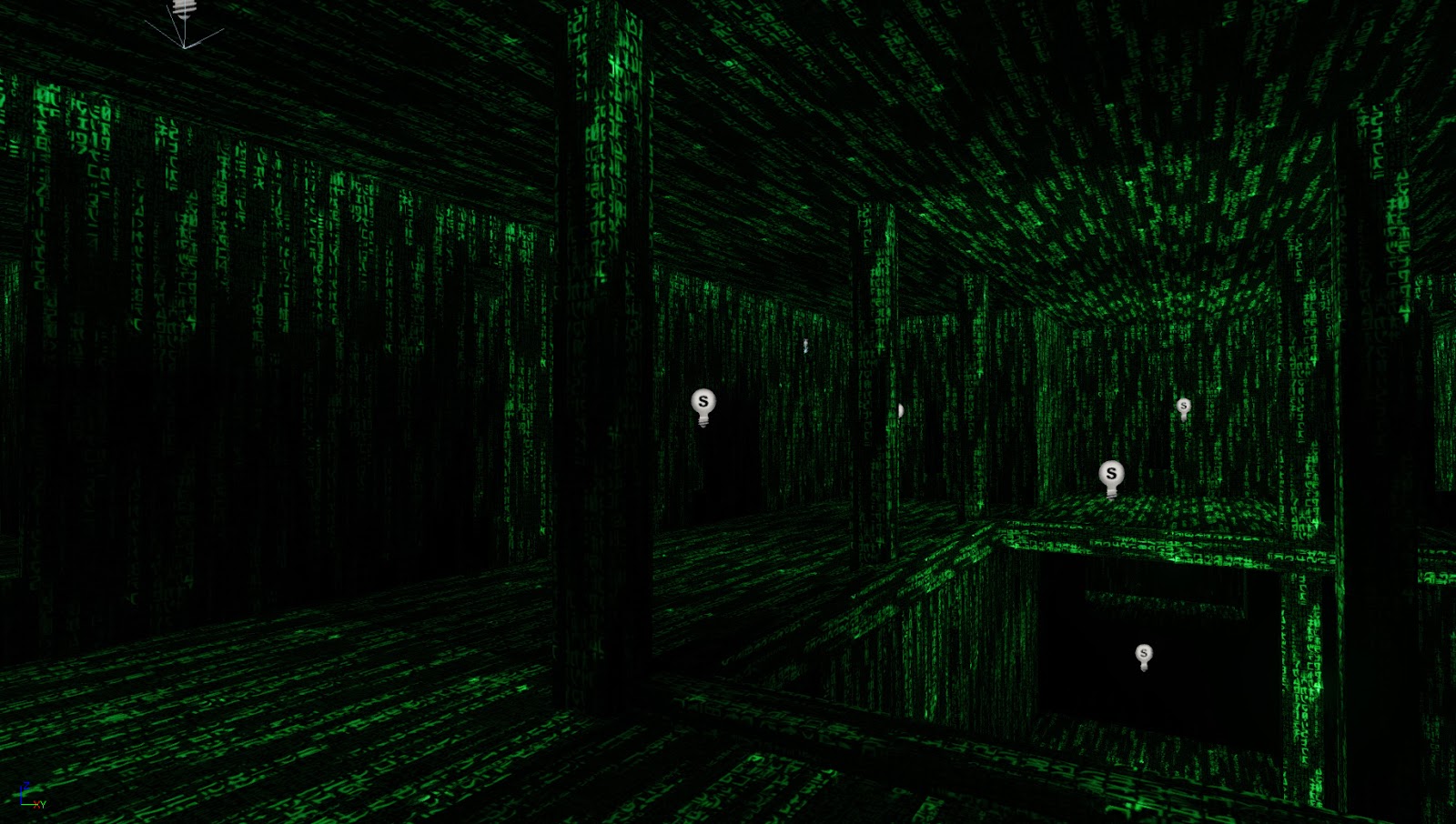
Here is a perfectly rendered scene:

It is dark, moody and reflects my lighting intent perfectly.
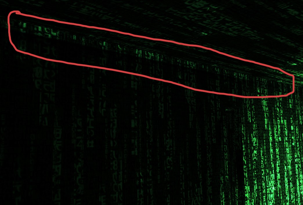
Here is the same scene with no light map UV channels:
Notice how there is light streaking down the walls and the lack of fidelity on the ceiling and poles. This is nasty and you'd blame UDK if you didn't know anything about light maps.
When I rendered that no-light-map scene, UDK warned me:

Now lets create non-proportional light maps. By this I mean that every surface, regardless of size, is treated equally in the light map. Here is the light map in blender:

The results are close but I still have bleeding along the top of the walls:

Now, one step I have left out is that I have up'd my Light Map resolution to 64:

If you leave that at the UDK default of 32, here is the result:
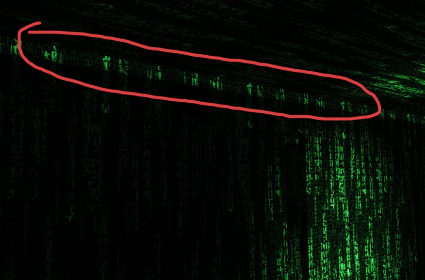
We are back to the light bleeding at the top of the wall. I can tell you, this took a while to straighten out.
Lets summarize what we've learned:
1. Creating a light map with proper spacing is not enough. You need to allocate more space in your light map to larger surfaces so that enough room is given to the baked in information.
2. Perfectly proportional light maps are also not enough. You need to pay careful attention to the Light map resolution on each mesh in UDK. Be careful though. Don't just up your resolution to 1024. That will increase your map size and slow down your lighting calculation. You want the smallest factor of 2 that will render properly. In my case, it was 64.
These 2 nuances make all the difference in perfectly lighting a scene. They are really 2 sides of the same coin. Each adjustment is giving more room to larger surfaces and there is a sweet spot where lighting will work properly. You need to experiment with your mesh to find the right balance.
Nice concept that you've got going on here man.. Looking forward to seeing the final version
ReplyDelete